Design system
Every token, component and animation used on this site, in one place. This page is the reference for all future work — if something here and something on a page disagree, this page wins.
01 — Typography
Typography
Cormorant Garamond for display, Plus Jakarta Sans for UI. The display face is never used below 20px.
.jw-display-xlclamp(56px, 11vw, 132px)Everything your community knows
जैन ध्यास · जैन विश्वास
જૈન ધ્યાસ · જૈન વિશ્વાસ
.jw-displayclamp(44px, 7.5vw, 88px)Everything your community knows
जैन ध्यास · जैन विश्वास
જૈન ધ્યાસ · જૈન વિશ્વાસ
.jw-h1clamp(34px, 4.6vw, 56px)Everything your community knows
जैन ध्यास · जैन विश्वास
જૈન ધ્યાસ · જૈન વિશ્વાસ
.jw-h2clamp(27px, 3.4vw, 40px)Everything your community knows
जैन ध्यास · जैन विश्वास
જૈન ધ્યાસ · જૈન વિશ્વાસ
.jw-h3clamp(21px, 2.2vw, 27px)Everything your community knows
जैन ध्यास · जैन विश्वास
જૈન ધ્યાસ · જૈન વિશ્વાસ
.jw-lead / body / .jw-eyebrowSmall caps eyebrow — 12px
Lead paragraph. Plus Jakarta Sans at clamp(17px, 1.6vw, 21px), line-height 1.65, capped at 62 characters.
Body copy at 16–17px, line-height 1.7, capped at 66 characters. Everything below 20px is Plus Jakarta Sans — the display face is never used at UI sizes, which is the single rule that keeps a Garamond-family site from looking amateurish.
देवनागरी शरीर पाठ — नोटो सैंस देवनागरी, छोटे आकारों के लिए बेहतर।
02 — Colour
Colour
What the five colours mean
Our palette is not decoration. The five colours of the Jain flag each stand for one of the Pañca-Parameṣṭhī — the five supreme beings saluted in the Navkar Mantra.
Arihant
अरिहंत
#FAF7F0
--color-pp-arihant
[object Object]
[object Object]
Siddha
सिद्ध
#9B2C36
--color-pp-siddha
[object Object]
[object Object]
Acharya
आचार्य
#C98A2B
--color-pp-acharya
[object Object]
[object Object]
Upadhyaya
उपाध्याय
#1F5F4E
--color-pp-upadhyaya
[object Object]
[object Object]
Sadhu & Sadhvi
साधु
#1C2B4A
--color-pp-sadhu
[object Object]
[object Object]
Stripe order and meanings verified against Jainpedia, Jain Heritage Centres and Wikipedia. Sources differ on whether the fifth stripe is dark blue or black; we use dark blue, which two of the three give.
Scarcity rule: these five appear together in exactly two places on the site — the Navkar Mantra line markers and the explainer beneath them. This page is the system reference, not a third usage.
Warm neutrals
--color-parchment
#FAF6ED
page background
--color-sand
#F2ECDF
alternating band
--color-clay
#E6DCC8
inset / well
--color-surface
#FFFFFF
cards
--color-line
#ECE4D6
hairline
--color-line-2
#DDD1BC
stronger hairline
Structural darks
--color-indigo-900
#121A2C
primary dark band
--color-indigo-800
#1C2B4A
dark surface
--color-indigo-700
#2A3D63
dark hover
--color-jade-900
#0F3B31
deep jade band
--color-jade-700
#1F5F4E
verified / trust
--color-jade-100
#E8F1ED
jade tint
Accents
--color-maroon-900
#4E1620
primary pressed
--color-maroon-700
#7A2430
primary action
--color-maroon-500
#9C3B47
primary hover ring
--color-saffron-500
#E88A3C
accent, gradients
--color-gold-600
#A8871F
ornament
--color-gold-700
#795D03
eyebrow text on LIGHT (AA on parchment, sand AND clay)
--color-gold-400
#E0BC4E
eyebrow text on DARK (9.48 indigo, 6.79 jade)
--color-saffron-700
#8F4A13
food accent as TEXT (4.89 on clay)
Ink
--color-ink
#201B19
body text
--color-ink-2
#4A403A
sub-heading
--color-muted
#6A5F57
secondary text — the smallest AA-safe tone
--color-faint
#9A8F86
DECORATION ONLY — never text (2.3–2.9:1)
The contrast rule
Every text tone on this site clears WCAG AA (4.5:1) on every band it can land on — surface, cream, parchment, sand and clay. A token tuned against one background is not tuned; measure it against all of them.
ink · ink-2 · mutedthe three text tones. Safe for any text, any size, on any light band.faintdecoration only — 2.3–2.9:1. Never text. If you want it for text, you want muted.parchment/55the floor for text on the dark bands. 45% measures 4.21 and 40% measures 3.60.
03 — Elevation
Elevation & Radius
- shadow-1
- shadow-2
- shadow-3
- shadow-4
- shadow-ring
- shadow-inset
- r-sm
- r-md
- r-lg
- r-xl
- r-pill
04 — Buttons
Buttons
variant="primary"variant="secondary"variant="jade"variant="ghost"on a dark band05 — Cards
Cards & Form controls
Standard card
shadow-ring at rest, lifts 2px with a slow sheen on hover.
With brackets
Gold corner marks at 30% on two opposite corners.
With tilt
≤4° pointer-follow, desktop and fine pointer only.
Well
Ornamental rule
06 — Icon set
Icon set
24×24 grid · 1.5px stroke · currentColor · no fills · never emoji.
- temple
- sthanak
- hall
- monk
- food
- stay
- tirth
- community
- directory
- group
- office-bearer
- business
- feed
- calendar
- book
- seva
- search
- location
- phone
- clock
- arrow-right
- arrow-up-right
- chevron-down
- check
- menu
- close
- globe
- shield
- heart
- star
- download
- apple
- play-store
Śvetāmbar tradition
- Svastikaस्वस्तिक
- Śrīvatsaश्रीवत्स
- Nandyāvartaनन्द्यावर्त
- Vardhamānakaवर्धमानक
- Bhadrāsanaभद्रासन
- Kalaśaकलश
- Darpaṇaदर्पण
- Mīnayugalaमीनयुगल
Digambar tradition
- Chatraछत्र
- Dhvajaध्वज
- Kalaśaकलश
- Chāmaraचामर
- Darpaṇaदर्पण
- Vyajanaव्यजन
- Supratiṣṭhaसुप्रतिष्ठ
- Bhṛṅgāraभृंगार
The two traditions list different symbols. Both sets are shown, neither is treated as the default.
Emblem
07 — Motion
Motion
Every animation is disabled under prefers-reduced-motion.
.jw-risesection reveal — 20px up + fade, 600ms
demo.jw-staggerchildren 70ms apart, capped at 8
demo.jw-text-masklines rise from behind a mask — max 2 per page
demo.jw-image-revealclip wipe from bottom + 1.06 scale settle
demo.jw-image-griddiagonal grid entrance, 80ms apart
demo.jw-rule-growornamental rule grows from the centre
demo.jw-drawSVG stroke draws itself
demo.jw-countinteger count-up, 1400ms ease-out
demo.jw-liftcard hover: 2px lift + shadow
demo.jw-sheen-slow1.4s light sweep on hover
demo.jw-magnetic≤6px pull toward the cursor
demo.jw-parallaxscroll-linked translate, 0.10–0.18
demo.jw-glow-pulse5s ambient pulse — hero glow only
demo.jw-breathe9s wave loop
demo.jw-drift24s gradient drift
demo.jw-progressscroll-progress hairline
demo
08 — Category colours
Seven categories, seven colours
The colour is doing a job: it tells you what kind of place a card is before you read it. That is what makes a wide palette a system rather than decoration — and it is why the accents appear in the header dropdown and on related-content cards, not only inside Discover.
An accent has two roles and they cannot share one value.accent is a fill — a dot, a rule, a chip.accentText is the same identity at a value that can be read as text on a light band. For five categories they are the same colour; forhalls and food they cannot be, because gold-600 is 2.51:1 on clay and saffron-600 is 2.67:1. Both shipped an unreadable category eyebrow until this was split.
| Category | Fill | Text | Chip | Text on clay | Text on chip |
|---|---|---|---|---|---|
| temple | Aa | temple | 7.27:1 | 9.17:1 | |
| sthanak | Aa | sthanak | 10.33:1 | 13.03:1 | |
| hall | Aa | hall | 4.57:1 | 4.99:1 | |
| darshan | Aa | darshan | 5.50:1 | 6.94:1 | |
| food | Aa | food | 4.89:1 | 4.69:1 | |
| stay | Aa | stay | 4.59:1 | 5.79:1 | |
| tirth | Aa | tirth | 8.18:1 | 10.32:1 |
Every figure measured against the worst band the element can land on — clay for text, the accent itself for a chip. All clear WCAG AA (4.5:1). Regenerate with the contrast script before changing any value here.
08 — Photo treatments
Photo treatments
treatment="none"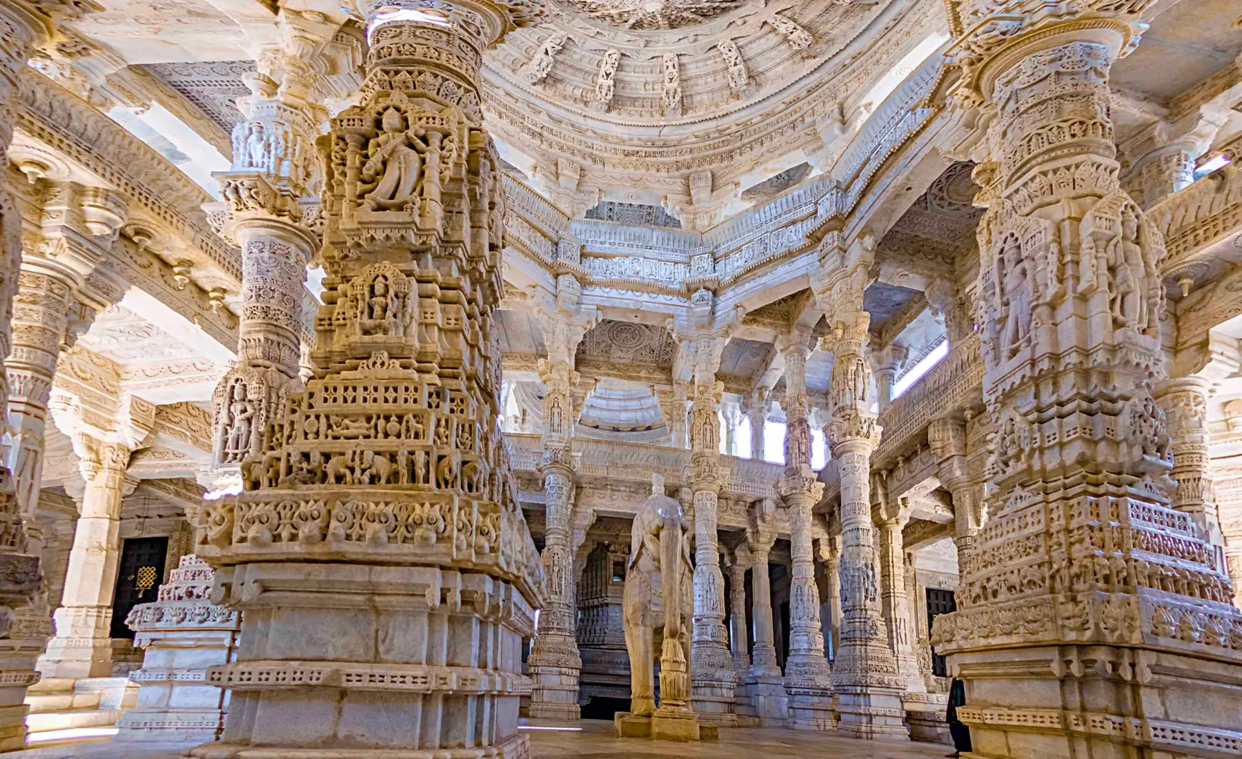
treatment="warm"treatment="duotone"